If you want to understand the relationship between two survey items, crosstab analysis is the answer. If you have ever used pivot tables in Excel, then you are already familiar with cross tabulation.
The benefits of cross tabulation are best illustrated with an example. The screen shots below show examples of the kind of information you get with crosstab analysis. You can quickly zoom in on "hot spots" and see the most significant relationships between the two items that you select.
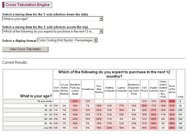
In this example from a market research survey, the red shading reveals several things. For example:
Notice how there is a clear relationship between age and video game system purchases. Not surprising, but certainly interesting to see it revealed in the data.
It is also interesting to see that a large percentage of respondents under 15 plan to purchase a hydration pack - but note that there are only 8 people in this group, so you might want to gather more data before drawing conclusions from what is shown here.
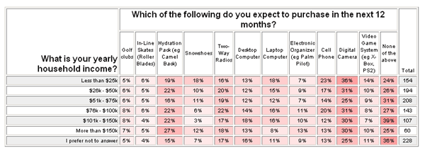
This second example (below) looks at the same question from a different perspective. It is interesting and perhaps surprising to see that there is not a strong relationship between income and purchases. In fact, for some items, it appears that those with smaller incomes are actually planning to make more purchases. Could be wishful thinking...
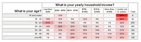
Now, let's complete this mini-analysis with the obvious next question - the relationship between age and income. As you would expect, there does appear to be a correlation between age and income, but what stands out most is the large number of people between 19 and 23 who earn less than $25k. Most likely, this represents college students...
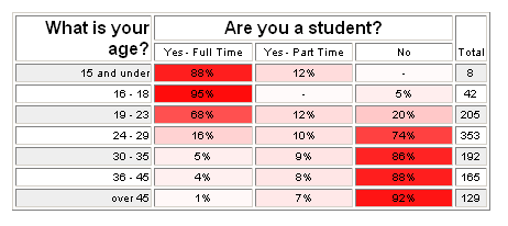
One last crosstab report shows that this hypothesis is correct.
We hope this example gives you a taste of how you might use cross tabulation analysis for your own survey. It is often an experimental (and fun) process of digging into the data and exploring relationships between items. Remember these final tips as you apply this technique to your survey.
The benefits of cross tabulation are best illustrated with an example. The screen shots below show examples of the kind of information you get with crosstab analysis. You can quickly zoom in on "hot spots" and see the most significant relationships between the two items that you select.
In this example from a market research survey, the red shading reveals several things. For example:
Notice how there is a clear relationship between age and video game system purchases. Not surprising, but certainly interesting to see it revealed in the data.
It is also interesting to see that a large percentage of respondents under 15 plan to purchase a hydration pack - but note that there are only 8 people in this group, so you might want to gather more data before drawing conclusions from what is shown here.
This second example (below) looks at the same question from a different perspective. It is interesting and perhaps surprising to see that there is not a strong relationship between income and purchases. In fact, for some items, it appears that those with smaller incomes are actually planning to make more purchases. Could be wishful thinking...
Now, let's complete this mini-analysis with the obvious next question - the relationship between age and income. As you would expect, there does appear to be a correlation between age and income, but what stands out most is the large number of people between 19 and 23 who earn less than $25k. Most likely, this represents college students...
One last crosstab report shows that this hypothesis is correct.
We hope this example gives you a taste of how you might use cross tabulation analysis for your own survey. It is often an experimental (and fun) process of digging into the data and exploring relationships between items. Remember these final tips as you apply this technique to your survey.
- Formulate hypotheses - Before you even start looking at the data, you might have some idea of what you expect to find there. Starting with a hypothesis or two is part of the scientific method and a great place to begin your analysis. This is often more effective than just mindlessly digging around looking for anything to pop up.
- Look for what is NOT there - In the above example, if we had not started with the hypothesis that people with greater incomes would be planning to make more purchases, we would not have noticed that there is actually not a strong relationship between these two things. This is informative information that could easily be overlooked.
- Look for the obvious - By looking for and finding obvious relationships (like age and student status), you validate your results and can proceed with greater confidence that the people who completed the survey did so accurately and honestly.
- Keep an open mind - Don't be a slave to your hypotheses. When you see things you don't expect, step back and ask yourself why the results might be as they are. Formulate new hypotheses and test them out to see if you are right. In the example above, you might wonder at first why there are so many people between 19 and 23 with small incomes. When you step back and think about it, the "student hypothesis" becomes a likely possibility.
- Trust the data - Part of keeping an open mind. If things don't look the way they are "supposed" to look, the problem is probably not with the data, but rather with your expectations. This is an opportunity to learn something new about your data.
- Watch the "n" - Be wary of small totals. If there are few respondents in a particular category, you should NOT trust the data, or at least, you should look for much stronger trends before trusting the results. In the first screen shot above, you see that 38% of those under 15 want hydration packs. There may be a relationship here, but there are only 8 people in the "under 15" category, so you should probably not trust this result. By contrast, 88% of those under 15 are students. This is a very strong relationship, so even for a small number of respondents, you can trust this result. (And of course, it makes sense that people under 15 are students.)
Knowing whether a relationship is strong enough or not strong enough with smaller respondent numbers takes some practice and experience. What you really want to know is whether the relationship is "statistically significant". This topic becomes rather technical, but one simple approach to statistical significance that we offer is a correlation analysis tool that uses "t-tests" and "p-levels" to provide you with a list of items that have statistically significant correlations.